[Bootstrap 4] 반응형 웹 대응하기
2022. 6. 2. 14:06ㆍJavaScript/Bootstrap
1. 반응형 웹
반응형 웹이란 브라우저의 가로 길이에 따라 사용자가 이용하기 편하도록 html 요소들의 가로 길이나 배치를 바꾸는 것을 의미합니다. 다음 그림은 웹 사이트가 최대창에서 줄어들었을때 태그들이 어떻게 변하는지 나온 결과입니다.
2. iframe, embed 요소
- iframe이나 embed 요소는 외부 html 요소를 가져와 보여주는 요소입니다.
- bootstrap에서는 이러한 요소들의 비율을 설정하고 반응형으로 처리될 수 있도록 클래스들을 지원하고 있습니다.
embed 주요 css 클래스
- embed-responsive
- embed-responsive-item
- embed-responsive-크기
- embed-responsive-21by9
- embed-responsive-16by9
- embed-responsive-4by3
- embed-responsive-1by1
<!-- 21by9 16by9 4by3 1by1-->
<h3>iframe, embed</h3>
<div class="embed-responsive embed-responsive-21by9">
    <iframe class="embed-responsive-item" src="https://www.youtube.com/embed/fn8Hz1UgCjg" title="YouTube video player"
        frameborder="0" allow="accelerometer; autoplay; clipboard-write; encrypted-media; gyroscope; picture-in-picture"
        allowfullscreen></iframe>
</div>
<div class="embed-responsive embed-responsive-16by9">
    <iframe class="embed-responsive-item" src="https://www.youtube.com/embed/fn8Hz1UgCjg" title="YouTube video player"
        frameborder="0" allow="accelerometer; autoplay; clipboard-write; encrypted-media; gyroscope; picture-in-picture"
        allowfullscreen></iframe>
</div>
<div class="embed-responsive embed-responsive-4by3">
    <iframe class="embed-responsive-item" src="https://www.youtube.com/embed/fn8Hz1UgCjg" title="YouTube video player"
        frameborder="0" allow="accelerometer; autoplay; clipboard-write; encrypted-media; gyroscope; picture-in-picture"
        allowfullscreen></iframe>
</div>
<div class="embed-responsive embed-responsive-1by1">
    <iframe class="embed-responsive-item" src="https://www.youtube.com/embed/fn8Hz1UgCjg" title="YouTube video player"
        frameborder="0" allow="accelerometer; autoplay; clipboard-write; encrypted-media; gyroscope; picture-in-picture"
        allowfullscreen></iframe>
</div>
<hr>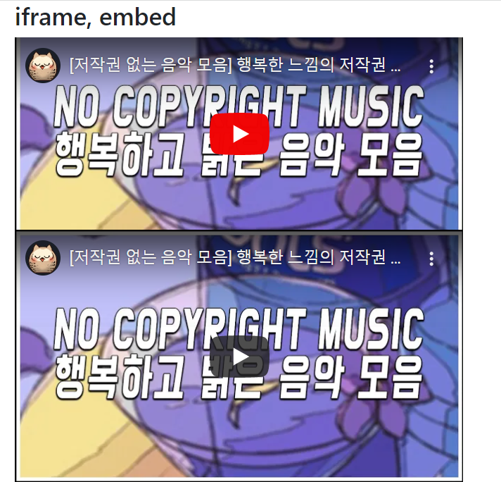

3. Grid 요소
- Grid 요소를 사용하면 가로로 12등분을 하여 각 요소가 차지하는 칸을 결정할 수 있습니다.
- 이 칸수를 사이즈마다 설정해 주면 반응형 웹에 대응할 수 있습니다.
<div class="row">
    <!-- col-sm-12 : 모바일 사이즈가 되면 12칸 차지할 예정
         col-md-6  : 중간 사이즈가 되면 6칸 차지할 예정
         col-lg-4  : 큰 사이즈가 되면 4칸 차지할 예정
    -->
    <div class="col-sm-12 col-md-6 col-lg-4 bg-primary" style="height: 150px;"></div>
    <div class="col-sm-12 col-md-6 col-lg-4 bg-info" style="height: 150px;"></div>
    <div class="col-sm-12 col-md-6 col-lg-4 bg-warning" style="height: 150px;"></div>
    <div class="col-sm-12 col-md-6 col-lg-4 bg-danger" style="height: 150px;"></div>
    <div class="col-sm-12 col-md-6 col-lg-4 bg-success" style="height: 150px;"></div>
    <div class="col-sm-12 col-md-6 col-lg-4 bg-dark" style="height: 150px;"></div>
</div>
<hr>
위 결과는 브라우저를 최대창으로 했을때 결과입니다. 최대창이므로 col-lg-4가 수행되어 한 영역당 4열씩 차지하는 것을 확인할 수 있습니다.

위 결과는 브라우저의 너비를 절반으로 줄였을때 결과입니다. col-md-6가 수행되어 한 영역당 6열씩 차지하는 것을 확인할 수 있습니다.

위 결과는 브라우저의 너비를 모바일 사이즈로 줄였을때 결과입니다. col-sm-12가 수행되어 한 영역당 12열씩 차지하는 것을 확인할 수 있습니다.
입력창의 반응형 웹 만들기
<div class="row">
    <div class="col-xl-3 col-lg-3 col-md-2 col-sm-1"></div>
    <div class="col-xl-6 col-lg-6 col-md-8 col-sm-10">
        <div class="card">
            <div class="card-body">
                <form action="#" method="post">
                    <div class="form-group">
                        <label for="a1">입력</label>
                        <input type="text" id="a1" class="form-control">
                    </div>
                </form>
            </div>
        </div>
    </div>
    <div class="col-xl-3 col-lg-3 col-md-2 col-sm-1"></div>
</div>
위 예제를 통하여 입력창이 브라우저의 크기에 따라 적절한 크기 형태를 유지하는 것을 볼 수 있습니다.
References
source code : https://github.com/yonghwankim-dev/Bootstrap_study/tree/main/Responsive/src/main/webapp
[인프런] 윤재성의 Bootstrap 4 & 3 Framework Tutorial
'JavaScript > Bootstrap' 카테고리의 다른 글
| [Bootstrap 4] Flex (0) | 2022.06.02 |
|---|---|
| [Bootstrap 4] 공통 클래스 2 (길이, 여백, 그림자, Block) (0) | 2022.06.02 |
| [Bootstrap 4] 공통 클래스 1 (border, rounded, float) (0) | 2022.06.02 |
| [Bootstrap 4] PopOver (0) | 2022.06.01 |
| [Bootstrap 4] ToolTip (0) | 2022.06.01 |